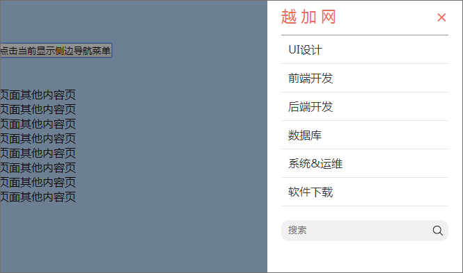
移动端网站侧边栏导航菜单,响应式网站侧边导航栏,兼容PC移动,响应式导航

直接上代码:
<!DOCTYPE html>
<html lang="en">
<head>
     <meta http-equiv="Content-Type" content="text/html; charset=UTF-8">
    <title>侧边导航栏</title>
	<!-- 设置缩放 -->
    <meta name="viewport" content="minimal-ui,width=device-width, initial-scale=1.0, maximum-scale=1.0, user-scalable=0">
	<meta name="viewport" content="width=device-width, user-scalable=no, initial-scale=1.0, maximum-scale=1.0, minimum-scale=1.0">
	<!-- IOS中禁用将数字识别为电话号码/忽略Android平台中对邮箱地址的识别 -->
    <meta name="format-detection" content="telephone=no">
	<!-- windows phone 点击无高光 -->
    <meta name="msapplication-tap-highlight" content="no">

 <style>
    *{margin:0;padding:0;}
	a{text-decoration:none;}
	input {outline:none;}
	.main{height:1000px;background:#b5d4f5;}
    /*移动端导航*/
	/*黑色*/
	.layerdivno{width:100%;height:100%;position:fixed; left:0; top:0;z-index: 40;display:none;background:rgba(0, 0, 0, 0.4);}
	input {outline:none;}
	.m_nav {width:280px; height:100%; background:#535d67; position:fixed; right:0; top:0; display:none;z-index: 50;}
	.m_nav .head{width:240px;line-height:50px;border-bottom:1px solid #dcdcdc; margin:0 20px 0 20px;}
	.m_nav .head a{font-size:20px;color:#fff;}
	.m_nav .m_nav_close{cursor:pointer;float:right;padding:0 0 0 20px;font-size:26px;color:#fff;}
	.m_nav .item{display:inline-block;width:230px;line-height:40px;border-bottom:1px solid #7c7f82;font-size:16px;color:#fff;margin:0 20px 0 20px;padding-left: 10px;background: url(../img/common/nav-more.png) right center no-repeat;}
	.m_nav .m_search{text-align:center;width:280px;}
	.m_nav .m_search .word {background: #f1f1f1;width: 190px;height: 30px;line-height: 30px;padding-left: 10px;border-radius: 10px 0 0 10px;display: inline-block;vertical-align: middle;border:none;margin: 20px 0 0 0;}
	.m_nav .m_search .search-btn {background: #f1f1f1;width: 20px;height: 20px;padding: 5px;margin: 0 10px 0px -5px;border-radius: 0 10px 10px 0;display: inline-block;vertical-align: middle;border:none;margin: 20px 0 0 0;}

	/*白色版*/
	.m_nav {background:#fff;}
	.m_nav .head{border-bottom:1px solid #999; }
	.m_nav .head a{font-size:22px;color:#EB6F5A;}
	.m_nav .m_nav_close{color:#EB6F5A;}
	.m_nav .item {border-bottom: 1px solid #e4e4e4;color: #383838;background: url(../img/common/nav-more2.png) right center no-repeat;}
	.m_nav .m_search .word {width: 200px;}
</style>
</head>
<body>
 <div>
	<div class="layerdivno"></div>
	<div class="m_nav">
		<div class="head"><a href="">越 加 网</a><span class="m_nav_close">×</span></div>
		<a href="" class="item">UI设计</a>
		<a href="" class="item">前端开发</a>
		<a href="" class="item">后端开发</a>
		<a href="" class="item">数据库</a>
		<a href="" class="item">系统&运维</a>
		<a href="" class="item">软件下载</a>
		<div class="m_search">
			<input type="text" class="word" placeholder="搜索"><input type="image" src="./search.png" class="search-btn" placeholder="">
		</div>
	</div>
	<div class="main">
		<br><br><br>
		<button class="m_nav_btn">点击当前显示侧边导航菜单</button>
		<br><br><br>
		<div class="con">
		页面其他内容页<br>页面其他内容页<br>页面其他内容页<br>页面其他内容页<br>页面其他内容页<br>页面其他内容页<br>页面其他内容页<br>页面其他内容页<br>
		</div>
	</div>
 </div>
 <script type="text/javascript" src="http://apps.bdimg.com/libs/jquery/1.8.3/jquery.min.js?v=2"></script>
 <script>
/*移动端导航*/
	$('.m_nav_close').click(function(e){
		e.stopPropagation()
		$('.m_nav').animate({width:'toggle'},300);
		$('.layerdivno').animate({width:'toggle'},0);
	});
	$('.m_nav_btn').click(function(e){
		e.stopPropagation()
		$('.m_nav').animate({width:'toggle'},300);
		$('.layerdivno').animate({width:'toggle'},0);
	});
	$('.layerdivno').click(function(){
		$('.layerdivno').animate({width:'toggle'},0);
		if($('.m_nav').is(':hidden')){

		}else{
			$('.m_nav').animate({width:'toggle'},300);
		}
	});
 </script>
</body>
</html>
效果图: